引言
1
2
3
4
5
6
7
8
9
10
11
12
13
14
15
16
17
18
19
20
21
22
| <!DOCTYPE html>
<html lang="en">
<head>
<meta charset="UTF-8">
<meta http-equiv="X-UA-Compatible" content="IE=edge">
<meta name="viewport" content="width=device-width, initial-scale=1.0">
<title>Document</title>
<style>
#x{
width: 100px;
height: 100px;
border-top: 30px solid red;
border-bottom: 30px solid black;
border-left: 30px solid green;
border-right: 30px solid blue;
}
</style>
</head>
<body>
<div id="x"></div>
</body>
</html>
|
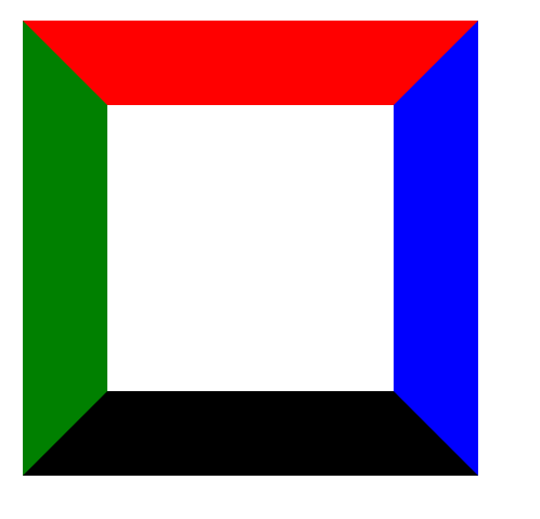
可以观察到,添加不同的边框之后边框交界处被对角切开,这也是因为边框覆盖的结果
以此可以引申出三角形的画法
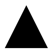
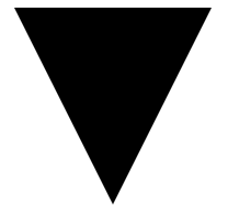
三角形
当我们把内容区的宽高设置为0的时候
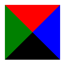
很容易想到只要将一些方向上的边框变为透明的就可以呈现出三角形的形状了
朝上(底边框+左右透明)
朝下(顶边框+左右透明)
朝左(右边框+上下透明)
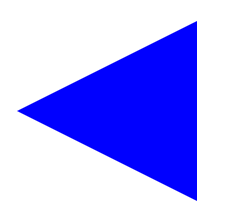
朝右(左边框+上下透明)
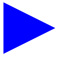
1
2
3
4
5
6
7
8
9
10
11
12
13
14
15
16
17
18
19
20
21
22
23
| <!DOCTYPE html>
<html lang="en">
<head>
<meta charset="UTF-8">
<meta http-equiv="X-UA-Compatible" content="IE=edge">
<meta name="viewport" content="width=device-width, initial-scale=1.0">
<title>Document</title>
<style>
#x {
width: 0;
border-top: 30px solid transparent;
border-bottom: 30px solid transparent;
border-left: 60px solid blue;
}
</style>
</head>
<body>
<div id="x"></div>
</body>
</html>
|
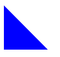
直角三角形(下边框遮掉右边框)
1
2
3
4
5
| #x {
border-bottom: 60px solid blue;
border-right: 60px solid transparent;
width: 0;
}
|
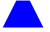
梯形
在三角形的基础上给定一定的宽度就可以扩展成梯形
1
2
3
4
5
6
| #x {
border-bottom: 60px solid blue;
border-left: 30px solid transparent;
border-right: 30px solid transparent;
width: 30px;
}
|
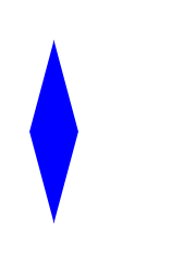
棱形
1
2
3
4
5
6
7
8
| #x {
margin-top: 100px;
width: 50px;
height: 50px;
transform: rotateZ(45deg)skew(30deg, 30deg);
//z轴3d旋转45°,2d倾斜30°
background: blue;
}
|
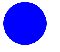
圆形
1
2
3
4
5
6
| #x {
height: 100px;
width: 100px;
border-radius: 50%;
background-color: blue;
}
|
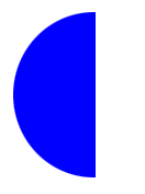
半圆
需要注意border-radius的顺序(从左上到左下顺时针),也可以设置为像素
1
2
3
4
5
6
| #x {
height: 100px;
width: 50px;
border-radius: 50px 0 0 50px;
background-color: blue;
}
|
心形
1
2
3
4
5
6
7
8
9
10
11
12
13
14
15
16
17
18
19
20
21
22
23
24
| .heart{
width:200px;
height:200px;
background-color:red;
transform:rotate(45deg) scale(.5);
}
.heart::before{
content:'';
width:200px;
height:200px;
border-radius:50%;
background-color:red;
position:absolute;
transform:translateX(-100px); //左上角的半圆
}
.heart::after{
content:'';
width:200px;
height:200px;
border-radius:50%;
background-color:red;
position:absolute;
transform:translateY(-100px); //右上角的半圆
}
|

可能还会补充吧,后面再说了…