需求
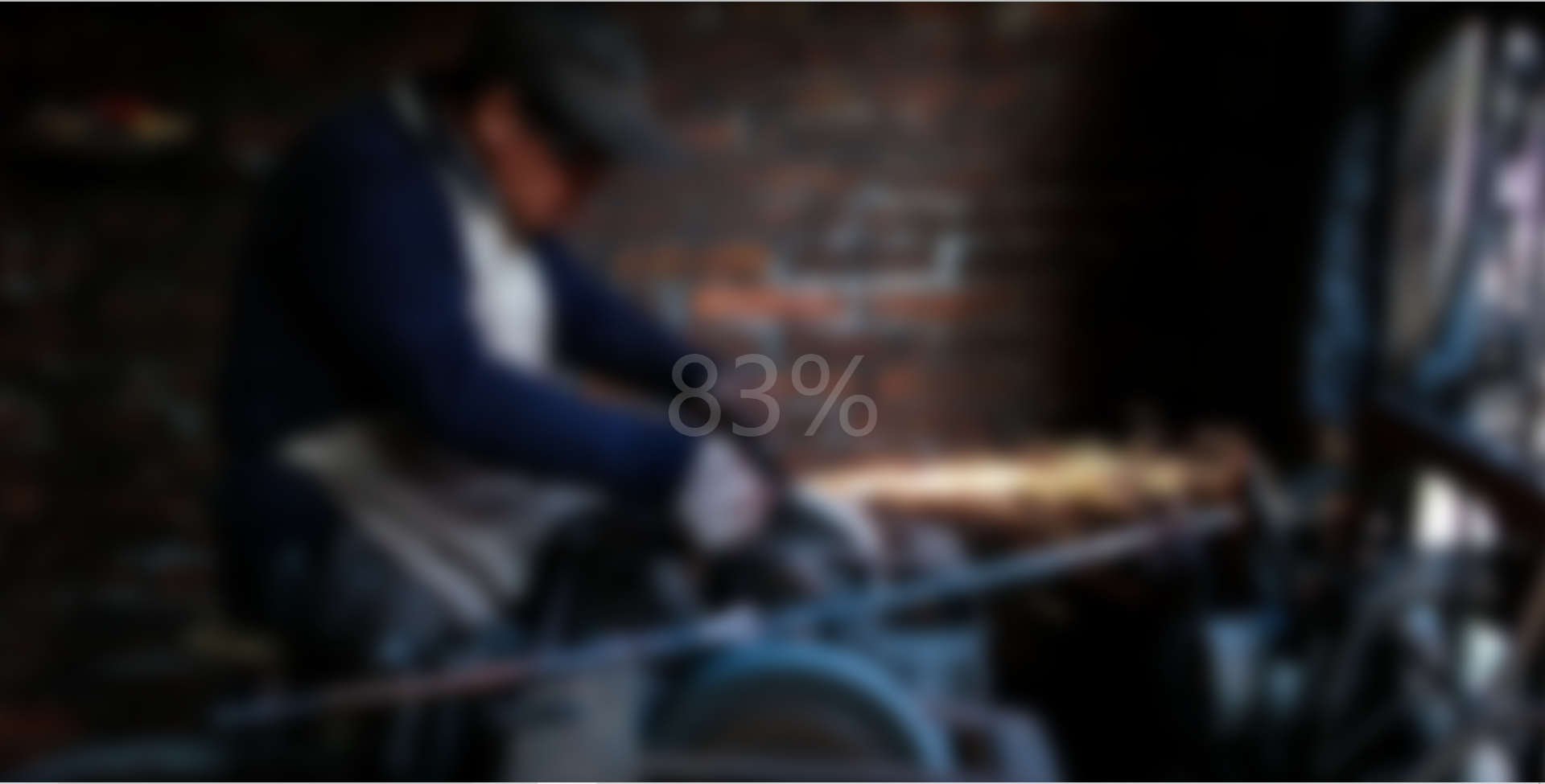
展示一张图片,随着时间的推移模糊度逐渐降低并显示加载进度,图片完全清晰之后进度消失
分析
要用到CSS的filter属性,通过JS控制进度显示以及模糊度的改变
实现
1
2
3
4
5
6
7
8
9
10
11
12
13
14
15
16
17
18
19
20
21
22
23
|
<!DOCTYPE html>
<html lang="en">
<head>
<meta charset="UTF-8" />
<meta http-equiv="X-UA-Compatible" content="IE=edge" />
<meta name="viewport" content="width=device-width, initial-scale=1.0" />
<title>Blurry Loading</title>
<link rel="stylesheet" href="style.css" />
</head>
<body>
<section class="bg"></section>
<div class="loading-text">0%</div>
<script src="./script.js"></script>
</body>
</html>
|
1
2
3
4
5
6
7
8
9
10
11
12
13
14
15
16
17
18
19
20
21
22
23
24
25
26
27
28
29
30
31
| @import url('https://fonts.googleapis.com/css?family=Ubuntu');
* {
margin: 0;
padding: 0;
box-sizing: border-box;
}
body {
height: 100vh;
display: flex;
justify-content: center;
align-items: center;
overflow: hidden;
}
.bg {
background: url('https://images.unsplash.com/photo-1576161787924-01bb08dad4a4?ixlib=rb-1.2.1&ixid=eyJhcHBfaWQiOjEyMDd9&auto=format&fit=crop&w=2104&q=80')
no-repeat center center/cover;
position: absolute;
top: -30px;
left: -30px;
width: calc(100vw + 60px);
height: calc(100vh + 60px);
filter: blur(0px);
}
.loading-text {
color: #fff;
font-size: 50px;
}
|
1
2
3
4
5
6
7
8
9
10
11
12
13
14
15
16
17
18
19
20
21
| const bg = document.querySelector('.bg')
const text = document.querySelector('.loading-text')
let load = 0
let initial = setInterval(blurring, 30)
function blurring() {
load++
if (load === 99) {
clearInterval(initial)
}
text.innerHTML = `${load}%`
text.style.opacity = scale(load, 0, 100, 1, 0)
bg.style.filter = `blur(${scale(load, 0, 100, 30, 0)}px)`
}
const scale = (num, in_min, in_max, out_min, out_max) => {
return ((num - in_min) * (out_max - out_min)) / (in_max - in_min) + out_min
}
|
总结
涉及到以下知识点
background:bg-color bg-image position/bg-size bg-repeat bg-origin bg-clip bg-attachment initial|inherit
bg-position:(left|right|center)(top|center|bottom) 设置背景图像的起始位置
也可以使用x% y% ,第一个值是水平位置,第二个值是垂直,左上角:0% 0% 右下角:100% 100%
如果只指定一个值,其他值为50%,默认值为0% 0%
也可以使用像素, xpx,ypx,表示将图片进行定位偏移,如果是0 0 的话就是根据左上点,如果是-50px -50px 表示讲图片 向左向上平移50px
bg-size:length|percentage|cover|contain 指定背景图片大小
length:width(px) height(px) 若只给定一个,第二个为auto
percentage:width(%) heigth(%) 若只给定一个,第二个为auto
cover:保持图像的纵横比并讲图像缩放成将完全覆盖背景定位区域的最小大小
contain:保持图像的纵横比并将图像缩放成适合背景定位区域的最大大小
bg-repeat:repeat|repeat-x|repeat-y|no-repeat|inherit 默认repeat,垂直和水平方向重复
一般设置为no-repeat
在设置定位时,将图片往左上方移了一部分,同时又加了长度和宽度,即省略边角部分
需要注意的是calc这个函数的参数必须要留空格
另外,还用到了filter属性
filter: none|blur()|brightness()|contrast()|drop-shadow()|grayscale()|hue-rotate() | invert() | opacity() | saturate() | sepia() | url();
blur:给图像设置高斯模糊,如果没有设置值,则默认为0;可以接受CSS长度值,不接受百分比值
在JS中,我们获取了文本节点和图片节点,通过定时器让进度不断增加,并依赖进度设置图片的模糊度以及文字的透明度,这个变化函数具有一定的借鉴意义。